Posts

Showing posts with the label Technique Cards

Glittery Snow Globe

Image
I have a collection of snow globes that I bring out every Christmas. A couple can stay out all winter long, but most have a Christmas theme. I have had a fascination for snow globes ever since I was a child and bought my first one on a trip to New York City. It was a plastic souvenir globe with the Statue of Liberty inside. So I was delighted when Stampin' Up! came out with this snow globe stamp set. There was another one a couple years ago, but it didn't compare to this one! I couldn't wait to make a card using the shaker domes. We made this card at my last stamp class. The insertion of the dome is much easier than you might think. In fact, it's super easy. The first thing I did was cut hole for the globe from the Shaded Spruce card stock, centering it. We laid that aside while working on the Christmas scene because I used the Crystal Effects with glitter (we now have Shimmery Crystal Effects for a single step) and it needed to dry. Of course, we colored the scen...

Floating Frame with the Painted Harvest Stamp Set

Image
Continuing to use the departing In Colors (in this case, Powder Pink and Lemon Lime Twist), I taught these cards to my stamp class last week. I used the removable tape method for these. Choosing the Painted Harvest stamp set meant we needed to do quite a bit of fussy cutting but I wanted to use larger elements. Plus, we could use the coordinating punch for the leaves. However, one of my ladies really struggled with so much fussy cutting. We used the Stamparatus to stamp the flowers, stamping each one twice to darken the ink. The flower centers are So Saffron. After stamping and cutting or punching out the elements, we arranged and adhered them to a 4" x 5-1/4" piece of card stock with removable adhesive. Then we cut out the center with the Rectangle Stitched Framelits Dies and began transferring each flower and leaf piece one by one to the card fronts using Stampin' Dimensionals. I am saddened to lose the Best Birds stamp set in the new catalog, although there...

Floating Frame Technique with Hold On to Hope Stamp Set

Image
This set of cards was made without the Press 'n Seal.  I do think that if I had made the card base Whisper White just like the frame, it would have looked more like it was floating. I believe it was an Australian demonstrator who demonstrated this technique using removable adhesive. And, no, Stampin' Up! does not carry removable adhesive, so you have to purchase it at a craft store. However, you could always use your SNAIL adhesive and rub away most of the stickiness, but if your pieces are fragile, you might tear them in the process. Yesterday's post used two of our retiring In Colors and today I'm using another. The Fresh Fig makes this card absolutely exquisite. At least I think so. With this set, I was able to die cut all the elements before attaching them to a 4" x 5-1/4" piece of card stock, using removable adhesive. I then used my Rectangle Stitched framelits Dies to cut a rectangle from the center. Next I peeled each element off, one at a time, ...

Floating Frame Technique with Tea Together Stamp Set

Image
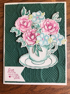
I think I must have watched every video produced on how to make a card that looks like it has a floating frame.  Jennifer MacGuire apparently created the technique using Press 'n Seal paper. That trick does make it easy to transfer the elements, but I struggled every time to peel off the Press and Seal without removing the top layer of my cardstock, taking the color with it. So I had to add more color with my markers after I'd finished. Plus there is a certain sticky film that remains behind on my card stock. I eventually came up with my own way of doing it, but the cards I'm showing here were my first ones and used the Press 'n Seal. They look great in spite of my struggles (just don't look too closely). I stamped and colored the flowers from the Tea Together stamp set and then die cut them. Next step was to arrange them on a 4" x 5-1/4" piece of card stock which was later discarded. Then I laid a piece of Press 'n Seal over the top, pressing it...

His Grace Easter Card

Image
Amazing how different this card looks from the one I posted yesterday. I've used a lighter check (Gingham Gala), added some bling and popped up an oval cut from the design, all of which combine to give a very different feeling to this card from yesterday's. I actually stamped and colored the piece of Whisper White card stock and then cut out an oval using one of the Oval Layering Framelits. I attached the stamped frame first with some all purpose glue and the popped up the center of the image using Stampin' Dimensional.  It wasn't difficult to align the elements of the image. This is the inside of the card. Products Used: His Grace cling stamp set (7), 148676, $20.00 Highland Heather 8-1/2" x 11" card stock (24), 146986, $8.50 Gorgeous Grape 8-1/2" x 11" card stock (24), 146987, $8.50 Whisper White 8-1/2" x 11" card stock (40), 100730, $9.75 Highland Heather Classic Stampin' Pad, 147103, $7.50 Gorgeous Grape Classic ...

Favorites with Tea Together

Image
Today I'm sharing two of my very favorite cards - at least at the moment. We made the top card at my February card class and I taught them the blender pen technique used here to add some color to the images without completely filling them in. I'm loving that technique! I got the idea for these cards from the sample on page 49 of the Occasions catalog. I studied the picture long and hard before I figured out how the images were colored. I think I figured it out correctly... The way I taught my class was to stamp the image in the color we want. The flowers all had two colors, one for the blossom and one for the leaves, so we used our markers to color the rubber stamps. I used some of my acrylic blocks as well as my silicone craft sheet to hold ink so ladies didn't have to wait for access to the ink pad. I love that ability!  All I do is tap the blocks against the ink pads to pick up the ink or rub the ink pads along the surface of the silicone sheet (I could put several c...

Emboss Resist Technique with By the Bay Stamp Set

Image
I have found the Emboss Resist technique to be fun and versatile. For this card, I decided to heat emboss the images from By the Bay in clear embossing powder and then sponge them with Pacific Point. At first I was disappointed; then I remembered that I needed to wipe the excess ink off with a tissue. Voila! The images appeared just as I had envisioned them. After mounting the stamped and embossed piece on Pacific Point card stock, I wrapped it with some twine I had laying around (I'm trying to use up some of my discontinued items).  You could probably use the Silver & Pool Party twine which would go well with the ink and might even bring out the rhinestones I used. Since it still needed something, I finished it off with the rhinestones. Products Used: By the Bay SAB cling stamp set (6), 149739, FREE with $50 purchase Whisper White 8-1/2" x 11" card stock (40), 100730, $9.75 Pacific Point 8-1/2" x 11" card stock (24), 111350, $8.50 Pacific Point Cl...

Spirited Snowmen

Image
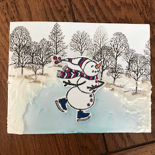
Our world has been shrouded in cold weather and snowy landscapes, so I just had to create a winter scene. Yes, it appears the Spirited Snowmen stamp set has been discontinued, but winter is not over and I decided to use that set for one of our class cards anyway. These are long-standing customers, so they understand when I choose to use something that's been discontinued on occasion. I've seen variations of this card all over Pinterest, so I'm not sure to whom credit goes. I still haven't perfected the use of my embossing paste. I do have the decorative masks, so I'll have to play around with them and the embossing paste. But the Shimmery White Embossing Paste is perfect for snow banks. I stamped the trees in the background with Early Espresso ink. Obviously the moisture in the embossing paste caused the ink to run a little, but winter time has its muddy places anyway, so it still works. I then sponged on some Balmy Blue ink for a pond and surrounded it with emb...

Love that Waterfront Stamp Set!

Image
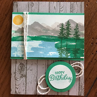
I'm getting more and more comfortable with the Waterfront stamp set as I keep playing with it. So versatile! That's part of what makes it so much fun. I wanted this card to feature that set yet not consume the whole card front, so I grabbed Gray Granite card stock, cut it to make my card and stamped the Hardwood background stamp on the front in the same color ink. And it's so much easier to use the Stamparatus with background stamps! I have discovered that it is always easier to design my picture by beginning with the mountains. Others may go about it differently, but that's what works for me. Stamping more than once before re-inking gives dimension to the mountains. I did the same thing for the water, giving it a more natural appearance. Living above a lake as I do, I am constantly amazed by the shifting shades on the water's surface. Although I used Very Vanilla card stock for stamping, you can't really tell because I lightly sponged Balmy Blue across th...

Painted Harvest Hedgehog

Image
I have seen this little guy on pinterest in so many settings and I just had to try it. We made this card at my June class and the attendees just raved about it. The scene is created with sponging and stamping. I think it looks like the hedgehog is peeking through the ferns. The designer paper and the wooden leaf are no longer in our catalog, but Stampin' Up! always has great things you can substitute. I began this scene by masking the bottom inch (about) with a Post-it note. Then I stamped the flower from Painted Harvest stamp set using Crumb Cake and Soft Suede inks. After removing the mask, I sponged on the Old Olive and then began adding the "ferns".  The face is from the Foxy Friends stamp set. The sky was created by sponging on some Balmy Blue ink. My original plan had been to wrap the dsp with the burlap ribbon, but I forgot to do so. Another creative opportunity, and I think I like this better than if I had wrapped it. Products Used: Painted Harvest photo...

Impossible Card

Image
When making this card with my class attendees, I had to assure them that my directions were correct. It just did not seem possible that the card would end up like the sample!  I think that's why its design is called "impossible". After realizing the theory behind this card, I hope to try one going the other direction. The hardest part of this card was cutting the designer paper to fit because it has a one way design. Otherwise, you simply cut two pieces of dsp 2-1/2" x 4" and then cut away the open area. I cut in 3/4" and down 2-1/8"; turn and cut to edge. Anyway, you just have to use a little math to do this on your own. I told my class attendees that you just have to remember the standard card size and be able to figure out half of each dimension. So, if the card is 4-1/4" x 5-1/2", you need to know that half of 4-1/4" is 2-1/8" and half of 5-1/2" is 2-3/4". The first step is to score and crease the length of your ...

Lovely as a Tree in Black Ice

Image
That black ice technique has captured me, in case you hadn't guessed. This time I used the evergreens from the Lovely As a Tree stamp set and I just love the way it turned out. The moon in this is from the Waterfront stamp set and is stamped in white. Otherwise, it is the same technique as I've used before: Draw edge of black ink pad over a piece of silver foil; stamp the desired images and make sure the ink is dry; use embossing buddy and then draw edge of VersaMark ink pad down the silver foil; cover with clear embossing powder and heat emboss. This card uses some long retired black grosgrain ribbon and a discontinued button. I so wish the camera would pick up the glazed effect of the heat embossing. Current Products Used: Lovely As a Tree rubber stamp set (6), W 128655, $28.00; C 127793, $20.00 Whisper White 8-1/2" x 11" card stock (40), 100730, $9.00 Basic Black 8-1/2" x 11" card stock (24), 121045, $8.00 Smoky Slate 8-1/2" x 11" ...

More Black Ice

Image
I had so much fun playing around with this Black Ice technique (details on previous post)! I just wish you could see the gleam from the layer of clear embossing.  Knowing my grandson would be graduating from community college this spring, I decided to use this technique on his graduation card. He loves his music and is especially into his guitars, although he also plays the violin. The background is accomplished by once again drawing the edge of the Basic Black ink pad across a piece of Smoky Slate card stock. I added three silver stars (Metallic Enamel Shapes) to the focal piece of this card. Because the card base is black, I decided the liner needed a little coordination with the card itself. So I added black streaks (a little grunge) and stamped another guitar in the corner. Products Used: Epic Celebration stamp set (SAB, discontinued) Basic Black 8-1/2" x 11" card stock (24), 121045, $8.00 Smoky Slate 8-1/2" x 11" card stock (24), 131202, $8.00...

The Black Ice Technique

Image
I have had a great deal of fun playing with the Black Ice Technique developed by Melissa Kerman and you will see a few posts showing this technique. I find it is a great technique for masculine cards, but can also be made more feminine by adding printed backgrounds, which is what I did for this card that we made at my March stamp class. This card utilizes our Fresh Fig In Color for the background and for the card base. I did "grunge" the 4" x 5-1/2" piece of  Fresh Fig Fresh Florals Designer Series Paper by dragging the Basic Black Archival ink pad across it. I simply tipped the pad so I was using only the edge as I dragged it down, turning the paper and doing so one again. I used a very light touch so as not to dirty the paper too much. For the "black ice", I used a piece of 3" x 3-1/4" Silver Foil And dragged the ink pad across its surface in the same way. Only the archival ink will stick to the foil, according to Melissa. You may wish to...

Springtime Foils Specialty Designer Series Paper

Image
The Sale-a-Bration flyer doesn't begin to show just how gorgeous this Springtime Foils Specialty Designer Series Paper is! And it is so versatile. Use it as it is or color part with blends or just smear ink on with an ink pad. On the two cards I'm showing here, I did some more fussy cutting, using the flowers in the design as my focal points. Both cards use the same dsp but are done so differently. For the first one, I used my Flirty Flamingo ink pad and smeared it across the card stock, coloring the entire background. I then chose a flower from the unused piece and cut it out, attaching it with a dimensional. The ribbon is last year's In Color ribbon in Flirty Flamingo. These colors are being retired in June when we get five new In Colors.  The embossed greetings for both cards come from the Heartfelt Blooms stamp set, also a Sale-a-Bration product. The embossing is done with Copper Stampin' Emboss Powder on Glossy White card stock for the first card and on Vellum ca...

Another Card Using the Eclipse Technique

Image
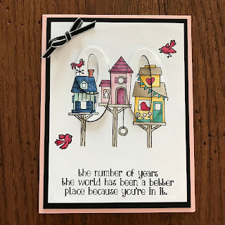
As you can tell from a previous post as well as this one, I know a number of people who have reached a new decade. I am loving the Flying Home stamp set colored with Stampin' Blends and then cut to accomplish this new favorite technique. At this point I have managed to use every image in this set, except the little bumble bee and butterflies. Look closely and you will see the raised 90 on this card front. Products Used: Flying Home Rubber Stamp Set (8), W 145926, $25.00; C 145929, $18.00 Number of Years photopolymer stamp set (29), 140653, $27.00 Whisper White 8-1/2" x 11" card stock (40), 100730, $9.00 Basic Black 8-1/2" x 11" card stock (24), 121045, $8.00 Powder Pink 8-1/2" x 11" card stock (24), 144244, $8.00 Cherry Cobbler Combo Pack Stampin' Blends (2), 144575, $9.00 Bermuda Bay Combo Pack Stampin' Blends (2), 144600, $9.00 Daffodil Delight Combo Pack Stampin' Blends (2), 144603, $9.00 Crumb Cake Combo Pack Stampin' B...

More Eclipse Technique

Image
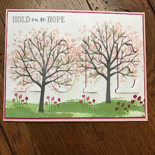
I had promised my faithful customers that I would teach the eclipse technique to them at my February class. I debated and debated how I would do so. Using the Large Letters framelits means I can only use words of four or fewer letters. The greeting on this card is from the Hold on to Hope stamp set. I used the verse that comes with the set (Isaiah 46:4) on the inside. It is a perfect verse for a couple mothers with prodigal sons. One is my daughter, whose son is what I term AWOL because he has turned his back on God and family, refusing contact with any of us. Very painful. But this card is cheerful and the blossoms on the tree speak of the hope of spring during winter. In a sense, these women are going through a winter season emotionally, but spring will come as we put our faith and trust in God. Yesterday's post has the instructions for this technique, so be sure to check it out. Products Used: Hold on to Hope rubber stamp set (10), W 145776, $29.00; C 145780, $21.00 ...

Eclipse Technique

Image
I have been wanting to play with the eclipse technique forever! Because the first cards I saw using this technique were made with the Large Letter Dies, I thought I had to obtain them before I could do the technique. But not so! Since I ordered them, I've seen other examples of this technique done with various shapes. Anyway, this birthday card is my first attempt and I love the way it turned out. The man who turned 80 last week also loves birds, so the Flying Home stamp set seemed a perfect fit. I mixed it with the Number of Years stamp set and used the Large Numbers Framelits for the 80. He was suitably impressed. And of course I had to use the Stampin' Blends to color the images! [You need to use the Memento ink pad with the alcohol-based Stampin' Blends.] The way I accomplished this technique, whether it's the official way or not, was to stamp my design on the 3-3/4" x 5" Whisper White card stock. Then I placed the framelits where I wanted them and ran...

And Still More

Image
I truly love the Painted Harvest stamp set and making my own designer paper was so much fun. I have to admit that the second time I stamped a full sheet of sunflowers, acorns and leaves, I placed the flowers closer together. I stamped the flowers first and then added the leaves, acorns and dots. But the cards I am sharing are the ones I made as samples before my class, "Eight Cards in a Flash". I thought it would be fun to have a sunflower peeking out from behind the designed layers. Add a ribbon and a greeting and I have a great Thanksgiving card. For this card, I used the sunflower as the focal point. I had a somewhat crumpled half doily laying around, so I scraped some Crushed Curry ink across its surface to use on my card. My original intention was to stamp the words in Tranquil Tide in the bottom right corner, although stamping the words all over was not part of that original plan, hence the blank space. But somehow I picked up one of the dimensional pap...

Two More from Eight Cards in a Flash

Image
This post is a continuation of yesterday's as I show more individual cards from my recent class. Now that I've learned this method of cutting my card stock, I just might cut colored card stock coordinating with various designer series paper packs and keep them together so I can throw cards together in a minimum of time. Here are the directions for cutting the Tranquil Tide card stock: Cut in half lengthwise, 4-1/4" x 11" each Rotate and cut one of those pieces in half, 4-1/2" x 5-1/2"; cut those two pieces in half, giving you four pieces measuring 2-1/8" x 5-1/2". Rotate the other original half sheet and cut at 2-3/4" three times, resulting in four pieces 2-3/4" x 4-1/4". [I must give credit for these measurements to Connie Stewart of Simply Simple Stamping.] Products Used: Painted Harvest photopolymer stamp set (13), 144783, $21.00 Basket of Wishes photopolymer stamp set (11), 142200, $17.00 Whisper White 8-1/2"...