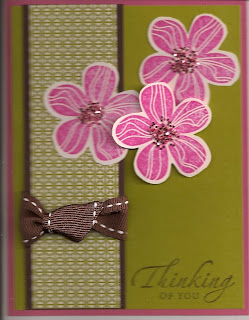
Posts

Showing posts from March, 2009

Playful Petals

Image
Take a little Tea Party designer paper, cut according to a Splitcoast Stampers sketch challenge, add a layered image stamped with a stamp from the Playful Petals set and get a cheerful, spring card. I stamped the flower with Basic Gray ink four different times, colored the images with blender pens, left one on the Whisper White square, and cut the others at the obvious layers. I then mounted each layer with dimensionals for the 3-D effect. You can even curl the tips of the petals upward for a little extra dimension, something that is lost when the card is flattened in the scanner. I simply chose my colors according to the colors in the designer paper, which meant Almost Amethyst, So Saffron and Pretty in Pink. The card itself is of Certainly Celery card stock to pick up the stripe in the designer paper. The white square is framed with Basic Gray card stock.

Punch Art Tea Cups

Image
I'm back from our trip to Ohio where I thoroughly enjoyed time with old friends! I need a thank you note (several, actually) and decided to play with punches. I had taken sample cards with me to show to my old stamping friends, who raved over one of the cards utilizing punch art, so my enthusiasm for technique was rekindled! I made the tea cups below with both the tag and small tag punches and the small and large oval punches. I also used the Boho Blossoms punch for the white flower decorating the cup. The eyelet border was made with one of our newest punches. I used up some old designer paper with the bashful blue and whisper white card stock. Finally, I experimented with my ribbon and like the way it turned out as well as the ease with which it went together. I cut my bashful blue grosgrain ribbon about 6-1/2 inches. Before tying the knot in the middle, I inserted a small piece of the ribbon and tied the knot around it. Then I fastened the ends under the whisper white car

One Set Four Ways

Image
I have noticed that customers tend to think they need lots and lots of stamp sets in order to create a variety of cards. I have to admit that I tend to think that way, too, but I am learning that one set can prove very versatile just by using different papers and accessories. So I decided to put my advice to work with Upsy Daisy, a favorite stamp set (you'll find a couple other cards on earlier posts with the same set). On this first card, I merely heat embossed on designer paper. The ticket corner punch and the wide oval punch plus coordinating ribbon dressed it up. The card stock is Baja Breeze and Candy Lane designer paper. The second card makes a great masculine card. Notice the shadow effect I used on the daisy silhouette this time. I merely stamped it once, moved the stamp over and stamped it again. For the words on this card, I used the Congrats set from the Sale-a-bration mini catalog. The card is made with Night of Navy and Brocade Blue card stock and designer pap

It Was a Color Challenge

Image
I just posted my first card ion the Splitcoast Stampers website in response to a color challenge! I wouldn't say it's my favorite card, but it did meet the requirements and I do like it. In all honesty, kiwi kiss is a favorite color of many stampers, but it is my least favorite. I also had some designer paper left that I found too busy for most of my projects. So I mounted a strip on chocolate chip card stock and added the bright flowers to make it work. The challenge was to use kiwi kiss, chocolate chip and pink passion in a card. The double-stitched ribbon and the light pink chunky sprinkles added texture. I hope you like it!